How to Improve Website Conversion Rates: A 2024 Guide to Boosting Conversions
Before you start A/B testing button colors or tweaking headlines, let’s talk about what really moves the needle in website conversions. It all comes down to a solid foundation of two things: a seamless user experience and unwavering trust. Get these right, and you create an environment where converting feels like the most natural next step for your visitors.
The Foundation of a High-Converting Website
It’s easy to get caught up chasing quick wins. Many businesses obsess over tiny details while their website's core structure actively works against them. The truth is, the most powerful conversion strategies aren't built on tricks; they're built on a rock-solid foundation of great UX and genuine credibility. A visitor who is confused, frustrated, or feels unsafe will simply leave. No amount of persuasive copy can fix a broken experience.
Think of your website like a physical retail store. If the entrance is hard to find, the aisles are messy, and the staff seems untrustworthy, you're not going to stick around to buy anything. Your digital storefront is no different. The path from a new visitor to a happy customer needs to be smooth, clear, and reassuring from the very first click. This is crucial for anyone wondering how to improve website conversion rates.
Create an Intuitive User Journey
A user should never have to stop and think, "What do I do next?" When your site's navigation is confusing or information is buried, you're practically begging people to bounce. The goal is to guide visitors effortlessly toward your conversion goal, whether that’s making a purchase, signing up for a trial, or getting in touch.
Mapping out and refining every touchpoint is key. This comprehensive guide to customer journey optimization is a great resource that breaks down exactly how to do that.
Here's what a truly intuitive journey looks like in practice:
- Crystal-Clear Navigation: Your main menu should be simple and use everyday language. Avoid clever jargon. A well-organized menu is a roadmap that gives visitors the confidence to explore your site.
- Logical Information Flow: Group related content together. For example, all your pricing plans should be in one place. Your case studies and testimonials could be under a "Customer Stories" or "Results" tab. It just needs to make sense.
- Highly Visible Calls-to-Action (CTAs): Your most important buttons need to stand out. Use a color that contrasts with your brand palette and write clear, action-oriented text that tells people exactly what will happen when they click.
Build Instant Credibility and Trust
On the internet, trust is paramount. No one will provide their email address, let alone their credit card details, if they don't trust you. Building that credibility starts the moment your page loads. A Stanford University study found that 75% of consumers judge a company’s credibility based on its website design alone.
The most overlooked aspect of conversion optimization isn't persuasion; it's reassurance. Your visitors are constantly asking, "Can I trust this company?" Every element on your site should answer with a resounding "Yes."
Here are the non-negotiables for building instant trust:
- Professional, Polished Design: A modern, clean design signals that you're a serious business. Typos, broken links, and dated layouts scream unprofessionalism and kill confidence.
- Visible Security Signals: Display SSL certificates and trust seals, especially near forms and at checkout. These badges are powerful visual cues that tell users their data is safe.
- Real Social Proof: Don't just say you're great—prove it. Feature testimonials from real customers, showcase logos of well-known clients, and publish detailed case studies. When visitors see that others have had a positive experience, their confidence in you skyrockets.
By focusing first on a smooth user journey and a fortress of trust, you’re not just improving your website; you're creating an environment where conversion becomes the easy, logical choice. Once that foundation is in place, every other optimization effort will be far more effective.
Winning the Conversion Game with Website Speed
In the race for online conversions, speed isn't just a feature—it's everything. A slow website is the digital equivalent of making customers walk through mud to reach your front door. Most just won't bother. Every split-second your site takes to load chips away at your conversion potential, making speed one of the highest-impact areas to optimize.
The link between page load speed and user action is undeniable. Recent data shows that websites loading in just one second can achieve conversion rates up to three times higher than sites that take five seconds to load. For e-commerce stores, that same one-second load time can result in 2.5 times more conversions than a five-second competitor. It’s a clear global trend: speed directly translates to revenue.
This reality underscores a simple but powerful truth: if you want to improve your website's conversion rate, start by making it faster.
Finding Your Speed Bottlenecks
Before you can fix things, you need to know what's broken. Don't rely on a gut feeling that your site "feels slow." You need hard data to pinpoint the specific elements dragging down your performance.
Your best first step is to run your site through a tool like Google PageSpeed Insights. It provides a detailed report card on your site’s performance, flagging specific problems and offering clear suggestions for how to fix them. It analyzes key metrics like:
- Largest Contentful Paint (LCP): Measures how long it takes for the most significant content on the page to become visible.
- First Input Delay (FID): Gauges how quickly your site responds when a user first interacts with it, like clicking a button.
- Cumulative Layout Shift (CLS): Checks for visual stability, measuring how much elements on the page jump around as they load.
These aren't just technical terms; they represent real-world user frustrations that directly cause people to leave your site.
Pro Tip: Focus on the "Opportunities" section of your PageSpeed Insights report. It's a prioritized to-do list showing where to focus for the biggest wins. Tackling issues like oversized images or render-blocking code can provide a quick and noticeable speed boost.
Core Optimizations for Lightning-Fast Load Times
Once you've diagnosed the issues, it's time to take action. The good news is that some of the most significant speed improvements come from a handful of fundamental optimizations.
Compress and Optimize Your ImagesMassive, unoptimized images are the most common speed offenders. Use a tool like TinyPNG or ImageOptim to shrink image file sizes without a noticeable drop in quality. Also, serve images in modern formats like WebP, which offers better compression than older JPEGs and PNGs.
Put Browser Caching to WorkBrowser caching tells a visitor's web browser to save parts of your website (like your logo, CSS files, and key images) on their local device. When they return, their browser can load those saved files instantly instead of re-downloading them, making repeat visits feel incredibly fast.
Minimize and Manage ScriptsEvery third-party script you add—for analytics, a live chat widget, or social media buttons—adds to your total load time. Regularly audit all your scripts. If a script isn't critical to the user experience or business goals, remove it. For the scripts you must keep, ensure they load asynchronously so they don't block the rest of your page from rendering.
Impact of Load Time on Conversion Rates
The table below illustrates the direct relationship between website page load speed and potential conversion rate uplift, showing why speed optimization is critical.
As you can see, even a two-second improvement can potentially double your conversions. These optimizations aren't just technical tweaks; they are direct drivers of business growth.
For merchants, speed is even more critical. If you run an online store, learning how to increase Shopify website speed is non-negotiable for faster load times and better sales.
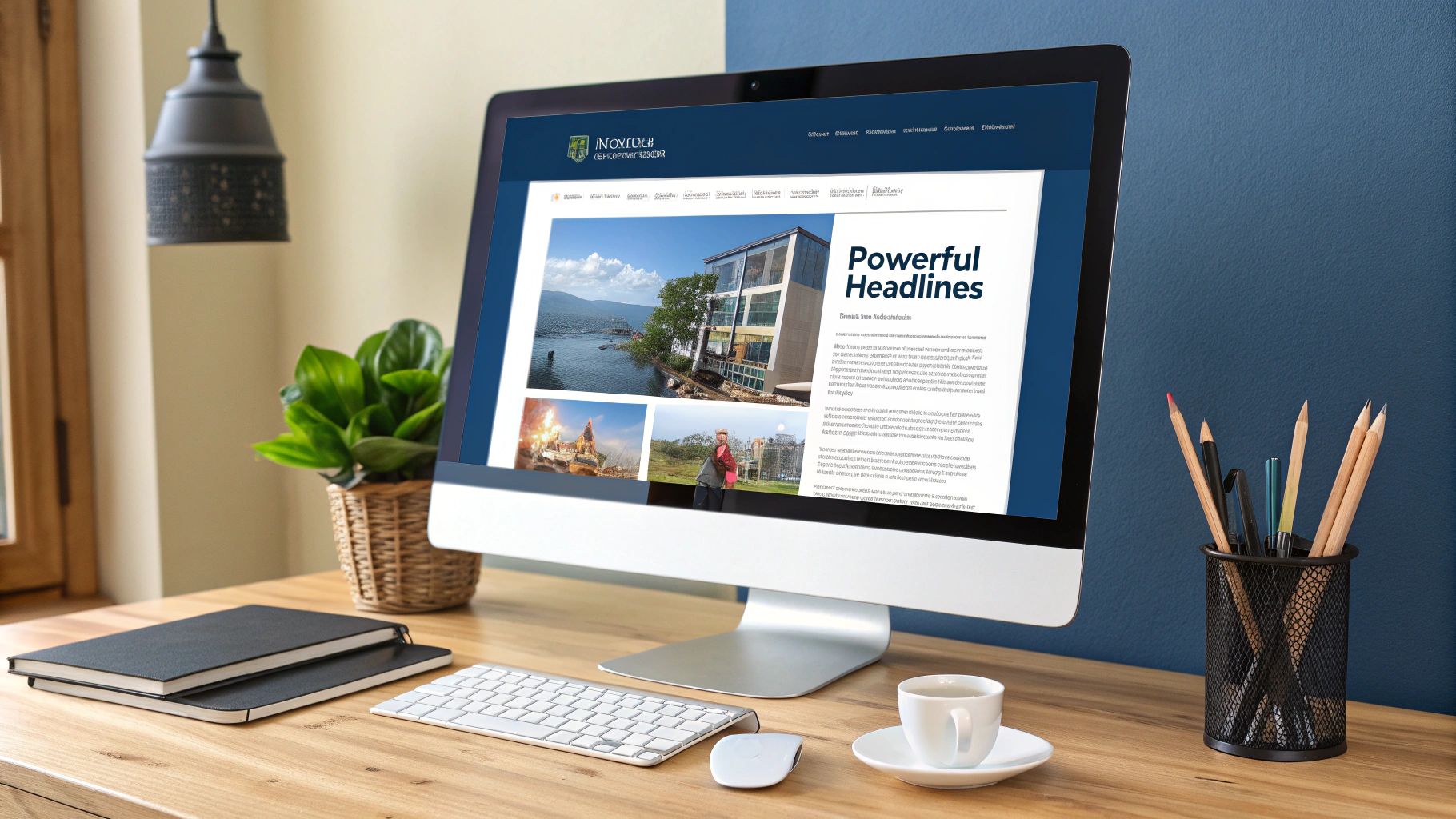
This image drives home how different optimizations can impact your results.
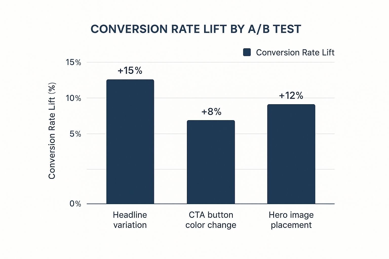
While testing button colors and image placement delivered good results, a powerful headline change produced the biggest lift at +15%. This is a great reminder to test all aspects of your page.
Tailoring Your Strategy to Different Traffic Sources

One of the biggest mistakes in conversion optimization is treating every visitor the same. This is a surefire way to leave money on the table. Where someone comes from—their traffic source—tells you a great deal about their mindset and what they're looking for. Getting this right is fundamental to improving your website's conversion rates.
Think about it. A person who clicks a specific Google Ad for "red running shoes" has a completely different intent than someone who stumbles upon your blog post about "marathon training tips" from an organic search. The first person is ready to buy now. The second is in research mode. If you show them both the exact same page, you’re almost guaranteed to fail to meet one of their needs.
Customizing the Experience for Paid Traffic
Let's start with paid traffic. Whether they’re coming from a search ad or a social media campaign, these visitors are often your hottest leads. They clicked on an ad that made a specific promise, and your landing page must deliver on that promise—immediately.
This is where message match is everything. The headline, images, and offer on your page need to be a direct reflection of the ad they just left. If your ad says "50% Off Winter Sale," that exact phrase needs to be the first thing they see. Any hesitation or confusion, and they're gone.
For these high-intent visitors, your only job is to create a frictionless path to conversion.
- Eliminate distractions. Remove the main navigation menu, sidebar links, or anything else that could pull them away from the goal.
- Keep the offer front and center. Your value proposition and call-to-action (CTA) must be visible the second the page loads, no scrolling required.
- Use a single, focused CTA. Don't confuse them with options like "Learn More" and "Buy Now." Pick one clear action that matches the ad's intent.
A visitor from a paid ad has already raised their hand. They're interested. Your job is to make it ridiculously easy for them to finish what they started. Don't make them think; guide them to convert.
Nurturing Your Organic and Referral Visitors
Organic search visitors are often a different breed. They usually land on your site looking for answers, not necessarily a product. They’ve found a blog post, a guide, or a case study. Here, a hard sell right out of the gate will scare them away. The goal is to build trust and demonstrate your expertise.
Your conversion strategy for this audience needs to be softer. Instead of a "Buy Now" button, your CTAs should be about continuing the conversation. Think along these lines:
- Offer a downloadable e-book or whitepaper related to the content they're reading.
- Invite them to subscribe to your newsletter for more expert tips.
- Suggest booking a free, no-pressure consultation to discuss their specific problems.
These are "micro-conversions." They gently pull visitors into your ecosystem, letting you build a relationship through email or other channels until they're truly ready to buy. You have to provide genuine value first to earn their trust and, eventually, their business.
Optimizing for High-Converting Direct Traffic
The source of your traffic has a massive impact on your strategy, and data backs this up. Recent studies show that direct traffic—people typing your URL straight into their browser—boasts the highest average conversion rate at 3.3%. Paid search is close behind at 3.2%. The numbers vary by industry; for instance, financial services saw paid search convert at 5.2%, while B2B services hovered around 0.9%. These stats highlight why a one-size-fits-all approach doesn't work. You can dig deeper into these conversion rate benchmarks to see how you stack up.
Since direct traffic visitors already know your brand, they often have the strongest intent. For them, efficiency is key. Ensure your homepage provides a clear, fast path to what they need—whether it's logging in, checking pricing, or finding support.
Crafting High-Converting CTAs and Forms

Let's talk about the finish line. Your call-to-action (CTA) button and the form behind it are where a casual browser decides to become a lead or customer. You can have the most persuasive copy and a lightning-fast page, but if this final step is clunky or confusing, you’ve lost them. A poorly designed CTA or a long, intimidating form is like a locked door at the end of the race.
The goal is to make clicking that button and filling out that form feel like an easy, obvious, and even exciting next step. This is a careful mix of psychology, clear language, and smart design. Getting this right is a non-negotiable part of improving your website's conversion rates.
Designing CTAs That Demand a Click
A CTA button isn't just a functional element; it's a powerful psychological nudge. Everything from the words you use to the color you choose impacts whether a visitor acts.
Use Strong, Action-Oriented Copy
Forget generic words like "Submit" or "Click Here." They're lifeless and uninspiring. They tell someone what to do but not why they should do it or what they'll get. A great CTA speaks to the user's motivation and completes the thought, "I want to..."
- Instead of "Submit," try "Get My Free Quote Now."
- Instead of "Download," go with "Grab My E-book."
- Instead of "Sign Up," use "Start My 30-Day Trial."
This simple switch in perspective—from what the user is giving up to what they're about to gain—makes the action far more compelling.
Make It Stand Out Visually
Your main CTA should be impossible to miss. Use a color that contrasts sharply with your page's design while remaining on-brand. If your website is mostly blues and greys, a bright orange or yellow button will jump off the page. Data consistently shows that a single, high-contrast CTA can make a huge difference in click-through rates.
Don't let your most important button blend into the scenery. Your CTA should be the most visually dominant element on the page, guiding the user's eye and clearly showing them what to do next.
Building Frictionless Forms Users Will Actually Complete
The moment a user starts typing into your form, a countdown begins. Every field you ask them to fill out adds friction and increases the chance they'll give up. In fact, studies show a staggering 27% of users will abandon a form if it feels too long or complicated. Your mission is simple: make your forms as short and painless as possible.
Only Ask for What You Absolutely Need
Be ruthless here. For an initial download or inquiry, do you really need their company size, job title, and mailing address right away? Probably not. A name and an email are often all you need to start the conversation. Remember, Expedia famously boosted its annual profit by $12 million just by removing one unnecessary field from its checkout form. That’s the power of simplicity.
Use Smart Form Design Techniques
Beyond reducing fields, a few simple design tweaks can dramatically improve the user experience.
- Multi-Step Forms: For longer processes like a full checkout or a detailed application, break the form into smaller, digestible chunks. Showing a progress bar gives users a sense of accomplishment and reduces overwhelm.
- Inline Validation: Give people real-time feedback. A small green checkmark next to a correctly formatted email is reassuring. Likewise, a clear error message ("Please enter a valid email") stops frustration before it starts.
- Conversational Approach: Why stick to a boring, static form? You can integrate interactive elements that make the process feel more like a friendly chat. To see how this works, it's helpful to understand what is conversational marketing and how it transforms forms into engaging dialogues.
By putting real thought into your CTAs and building frictionless forms, you're clearing the final hurdles to conversion.
A Data-Driven Approach to Ecommerce Conversions
When you’re running an ecommerce business, boosting conversion rates isn’t just about having a pretty website—it’s about being relentless with your data. The path from browsing to buying is often fast and emotional. A single blurry product photo or a confusing checkout step can torpedo a sale in an instant. This is where a data-driven mindset saves the day, helping you move past guesswork to find the exact friction points costing you money.
Think of your website less like a static brochure and more like a living sales floor that you can constantly rearrange and improve. Understanding the numbers behind your visitors' actions allows you to make surgical changes that have a direct, measurable impact on your bottom line.
Setting Realistic Benchmarks
Before you can improve, you have to know where you stand. Conversion rates aren't a one-size-fits-all metric. Your numbers will look vastly different depending on your industry, traffic source, and the devices people are using.
Globally, ecommerce conversion rates tend to float between 2% and 4%, but that's just a ballpark figure. Data from Shopify, for example, shows a platform-wide average of 1.4%. But the real story is in the details—the top 20% of stores on the platform hit rates over 3.2%. Traffic source matters, too. Email marketing often excels with a 5.9% conversion rate, while social media might only bring in 1.8%.
Your goal isn't to chase a mythical "good" conversion rate. It's to establish your own baseline and then work tirelessly to beat it, month after month. That's how you win.
Optimizing High-Impact Ecommerce Pages
While every page on your site has a job to do, in ecommerce, a few key pages do most of the heavy lifting. Focusing your energy here will yield the biggest and fastest results.
Product Pages That Sell ThemselvesThis is the make-or-break moment. Your product page must answer every potential question a customer has while also creating an emotional connection to the item.
- Rich Media is a Must: Don't settle for one static photo. You need high-resolution images from every angle, 360-degree views, and short videos showing the product in action.
- Write Compelling Descriptions: Stop listing features and start selling benefits. Instead of "100% cotton," try "Made with soft, breathable cotton that feels amazing all day long."
- Use Urgency and Scarcity: Simple cues like "Only 3 left in stock!" or a sale countdown timer are incredibly effective at encouraging people to act now.
A Frictionless Checkout ProcessThe checkout is where your most motivated customers land—and, shockingly, where most of them leave. Nearly 70% of all shopping carts are abandoned, and a clunky checkout is often the culprit. Your one job here is to make giving you money as easy as possible.
- Offer Guest Checkout: Forcing account creation is a notorious conversion killer. Always provide a guest option.
- Display Trust Signals: Make your security badges (like SSL certificates) and accepted payment logos (Visa, PayPal, etc.) impossible to miss.
- Be Upfront About Costs: Surprise shipping fees are the number one reason people abandon their carts. Show the all-in price right away.
- Keep Forms Simple: Use address auto-fill and only ask for the information you absolutely need. The fewer fields to fill, the more people will complete the purchase. These principles are also crucial lead generation best practices for B2B companies.
The Power of Social ProofFor someone shopping online, trust is everything. They can't touch the product, so they rely on the experiences of others. This makes social proof one of your most potent conversion tools.
Authentic customer reviews are gold. Research consistently shows that product pages with reviews convert far better than those without. Sprinkle star ratings and top reviews directly on your product and category pages. Encourage customers to upload photos with their reviews—seeing real people loving your products is incredibly persuasive.
Answering Your Top Questions About Conversion Rates
Even with a great plan, you're bound to have questions as you work to improve your website's conversion rates. Here are answers to some of the most common ones.
What Is a Good Website Conversion Rate?
The honest answer is: it depends. A "good" conversion rate is relative to your industry, business model, and traffic sources. While you'll see a general benchmark of 2-4% mentioned, focusing on a universal number is a trap. A top-tier ecommerce site might achieve over 4.7%, while a B2B company with a long sales cycle might be thrilled with a fraction of that.
Your most important benchmark is your own past performance. If you're converting at 1% today, a fantastic and realistic goal is to reach 1.5% next quarter. Focus on sustainable growth driven by your own data.
How Long Until I See Results from CRO?
The timeline for seeing a real impact from Conversion Rate Optimization (CRO) varies. It depends on the size of your changes and, crucially, how much traffic you have.
- Quick Wins: On a high-traffic page, a simple test—like rewriting a button's text—can show a statistically significant result in a few days or a week.
- Bigger Projects: Major overhauls like a full website redesign or a new checkout process are a long-term play. These can take weeks or months just to build and gather enough data to prove their effectiveness.
Patience is key in CRO. It's about building a consistent process of testing and learning over time.
Where Should I Start My Optimization Efforts?
When you have a dozen ideas, figuring out where to start can feel paralyzing. Follow the data to find the "low-hanging fruit"—the spots where a small effort will yield the biggest return.
Use a tool like Google Analytics to find your "leaky bucket"—pages with high traffic but a high bounce rate or a low conversion rate. Plugging these holes is almost always your best first move.
From my experience, these are common high-impact starting points:
- Boost Page Speed: As we've covered, speed is a massive conversion driver. Fixing it often delivers an immediate lift.
- Sharpen Your Value Proposition: Does your homepage headline instantly tell people what you do and why they should care? If not, start there.
- Strengthen Your Main CTA: Make your primary call-to-action button compelling, clear, and visually distinct.
- Cut Down Form Fields: Take a hard look at your sign-up or contact forms. If a field isn't essential, remove it.
By implementing these strategies, you can begin to systematically improve your website conversion rates, turning more visitors into valuable customers and driving sustainable business growth.
Ready to turn more visitors into loyal customers? Worknet.ai Inc transforms your website engagement with AI-powered chat that guides users, qualifies leads, and accelerates conversions in real time. See how you can build a frictionless journey from first touch to final sale at https://worknet.ai.
FAQs
.png)
Lorem ipsum dolor sit amet, consectetur adipiscing elit. Suspendisse varius enim in eros elementum tristique. Duis cursus, mi quis viverra ornare, eros dolor interdum nulla, ut commodo diam libero vitae erat. Aenean faucibus nibh et justo cursus id rutrum lorem imperdiet. Nunc ut sem vitae risus tristique posuere.
Lorem ipsum dolor sit amet, consectetur adipiscing elit. Suspendisse varius enim in eros elementum tristique. Duis cursus, mi quis viverra ornare, eros dolor interdum nulla, ut commodo diam libero vitae erat. Aenean faucibus nibh et justo cursus id rutrum lorem imperdiet. Nunc ut sem vitae risus tristique posuere.
Lorem ipsum dolor sit amet, consectetur adipiscing elit. Suspendisse varius enim in eros elementum tristique. Duis cursus, mi quis viverra ornare, eros dolor interdum nulla, ut commodo diam libero vitae erat. Aenean faucibus nibh et justo cursus id rutrum lorem imperdiet. Nunc ut sem vitae risus tristique posuere.
Lorem ipsum dolor sit amet, consectetur adipiscing elit. Suspendisse varius enim in eros elementum tristique. Duis cursus, mi quis viverra ornare, eros dolor interdum nulla, ut commodo diam libero vitae erat. Aenean faucibus nibh et justo cursus id rutrum lorem imperdiet. Nunc ut sem vitae risus tristique posuere.
Lorem ipsum dolor sit amet, consectetur adipiscing elit. Suspendisse varius enim in eros elementum tristique. Duis cursus, mi quis viverra ornare, eros dolor interdum nulla, ut commodo diam libero vitae erat. Aenean faucibus nibh et justo cursus id rutrum lorem imperdiet. Nunc ut sem vitae risus tristique posuere.
Lorem ipsum dolor sit amet, consectetur adipiscing elit. Suspendisse varius enim in eros elementum tristique. Duis cursus, mi quis viverra ornare, eros dolor interdum nulla, ut commodo diam libero vitae erat. Aenean faucibus nibh et justo cursus id rutrum lorem imperdiet. Nunc ut sem vitae risus tristique posuere.
Lorem ipsum dolor sit amet, consectetur adipiscing elit. Suspendisse varius enim in eros elementum tristique. Duis cursus, mi quis viverra ornare, eros dolor interdum nulla, ut commodo diam libero vitae erat. Aenean faucibus nibh et justo cursus id rutrum lorem imperdiet. Nunc ut sem vitae risus tristique posuere.
Lorem ipsum dolor sit amet, consectetur adipiscing elit. Suspendisse varius enim in eros elementum tristique. Duis cursus, mi quis viverra ornare, eros dolor interdum nulla, ut commodo diam libero vitae erat. Aenean faucibus nibh et justo cursus id rutrum lorem imperdiet. Nunc ut sem vitae risus tristique posuere.
Lorem ipsum dolor sit amet, consectetur adipiscing elit. Suspendisse varius enim in eros elementum tristique. Duis cursus, mi quis viverra ornare, eros dolor interdum nulla, ut commodo diam libero vitae erat. Aenean faucibus nibh et justo cursus id rutrum lorem imperdiet. Nunc ut sem vitae risus tristique posuere.
Lorem ipsum dolor sit amet, consectetur adipiscing elit. Suspendisse varius enim in eros elementum tristique. Duis cursus, mi quis viverra ornare, eros dolor interdum nulla, ut commodo diam libero vitae erat. Aenean faucibus nibh et justo cursus id rutrum lorem imperdiet. Nunc ut sem vitae risus tristique posuere.
.webp)
.webp)
.webp)


